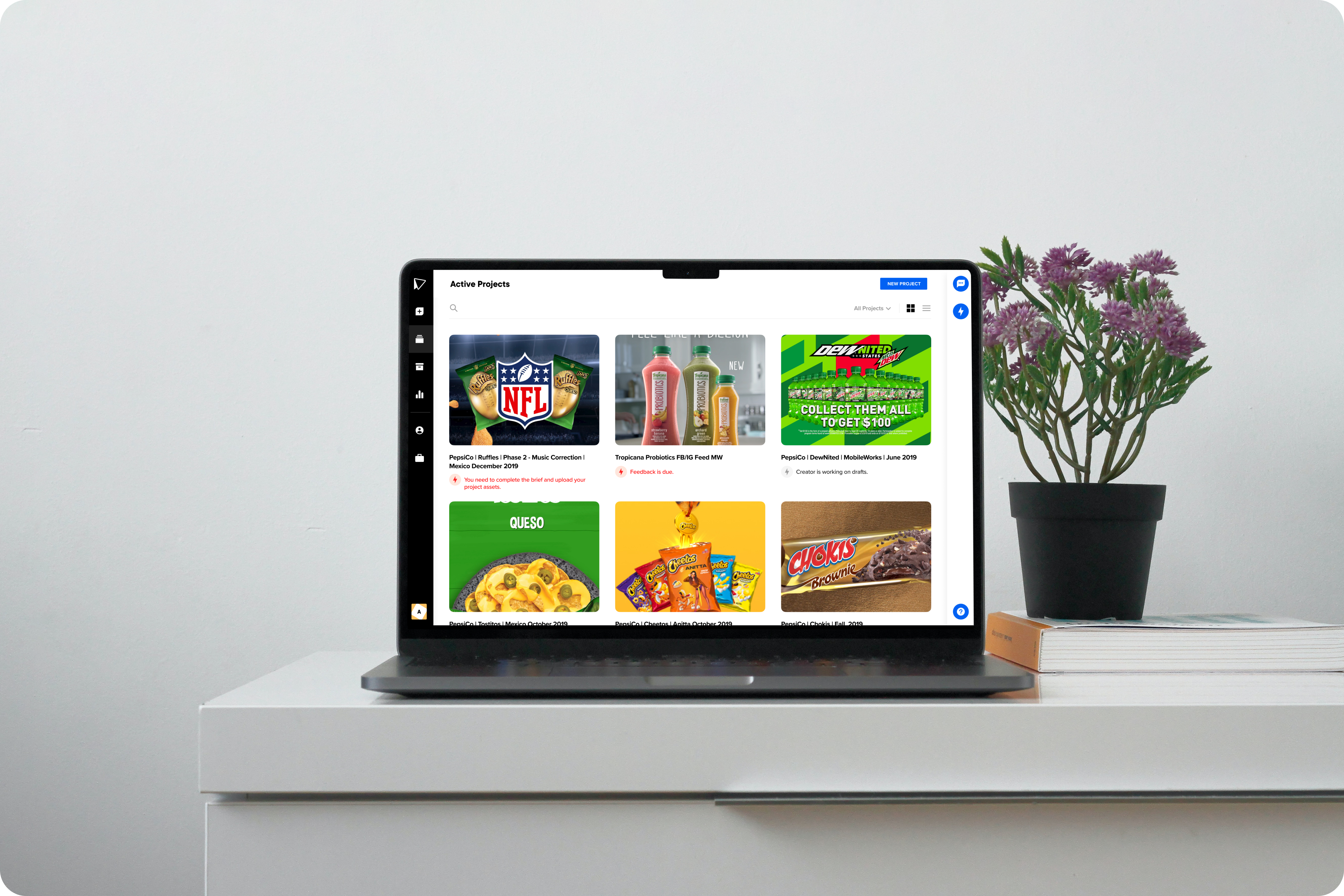
Problem:
Users have trouble keeping track of each project and what action they need to take in order to move the project along. Users also need to better be able to identify each project and the former layout of list items didn't help.
Objective:
Allow users to better identify which project they need to focus on by highlighting and prioritizing the key action the user needs to take within each project.
Process:
We started by running a card sorting exercise with internal project managers to better understand what information about the project was most important to highlight in the active projects page. From that session we learned the three most important elements of a project are the primary or hero output image, the name, and the status.
Upon digging into the statuses we realized they needed a full revamp as well so we created a separate initiative to tackle those updates. Ultimately we ended up overhauling our messaging and communication as a whole and reducing the number of communications sent out per project by 35%. We did this by identifying the most important actions and focusing on them as statuses and notifications to ensure users weren't confused while they went about creating their digital advertising campaign.
After we ran the card sorting exercise we created wireframes and tested them externally to validate our thinking. Using Lookback.io I ran multiple sessions with clients that further validated our initial thought and direction.
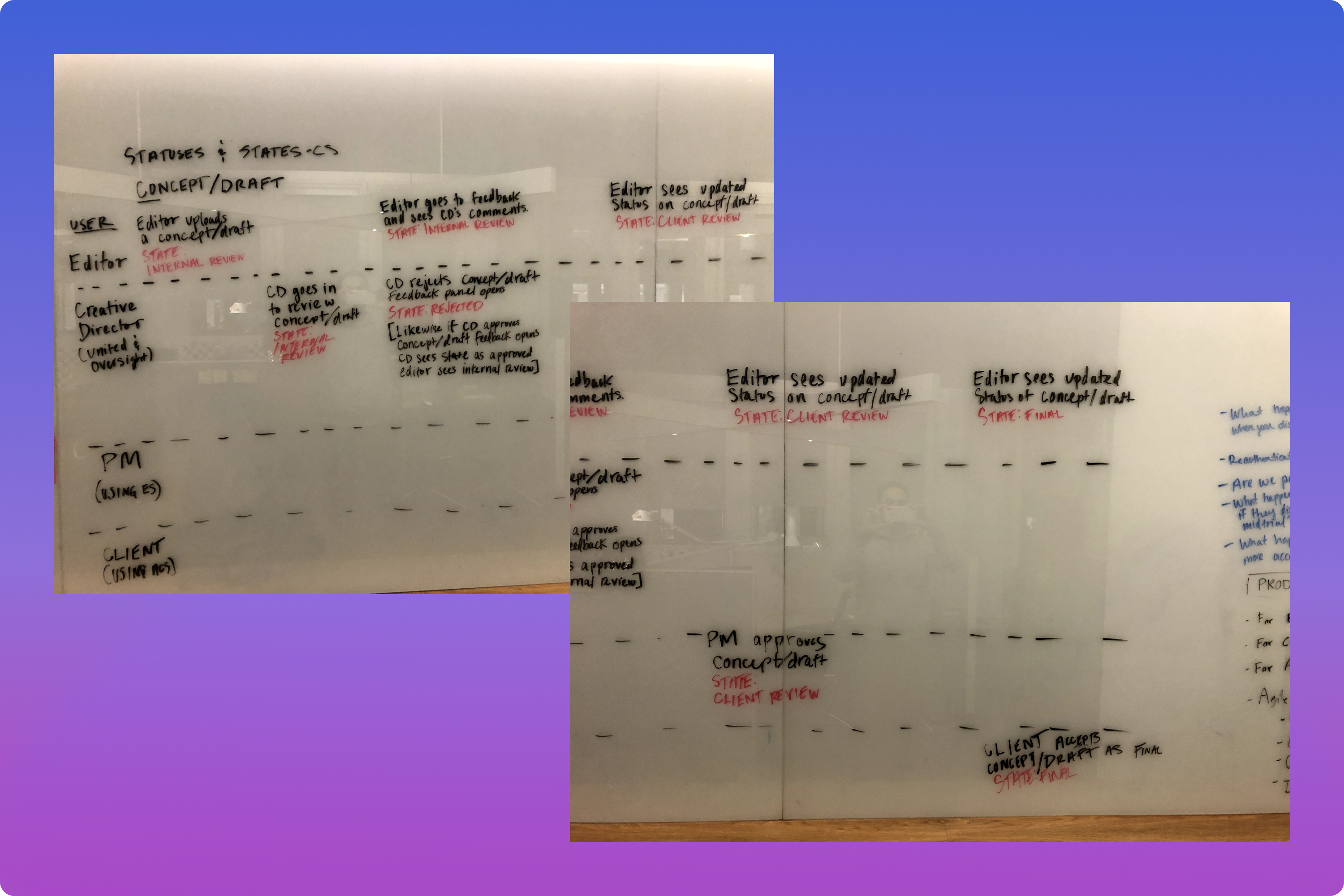
Whiteboarding project statuses
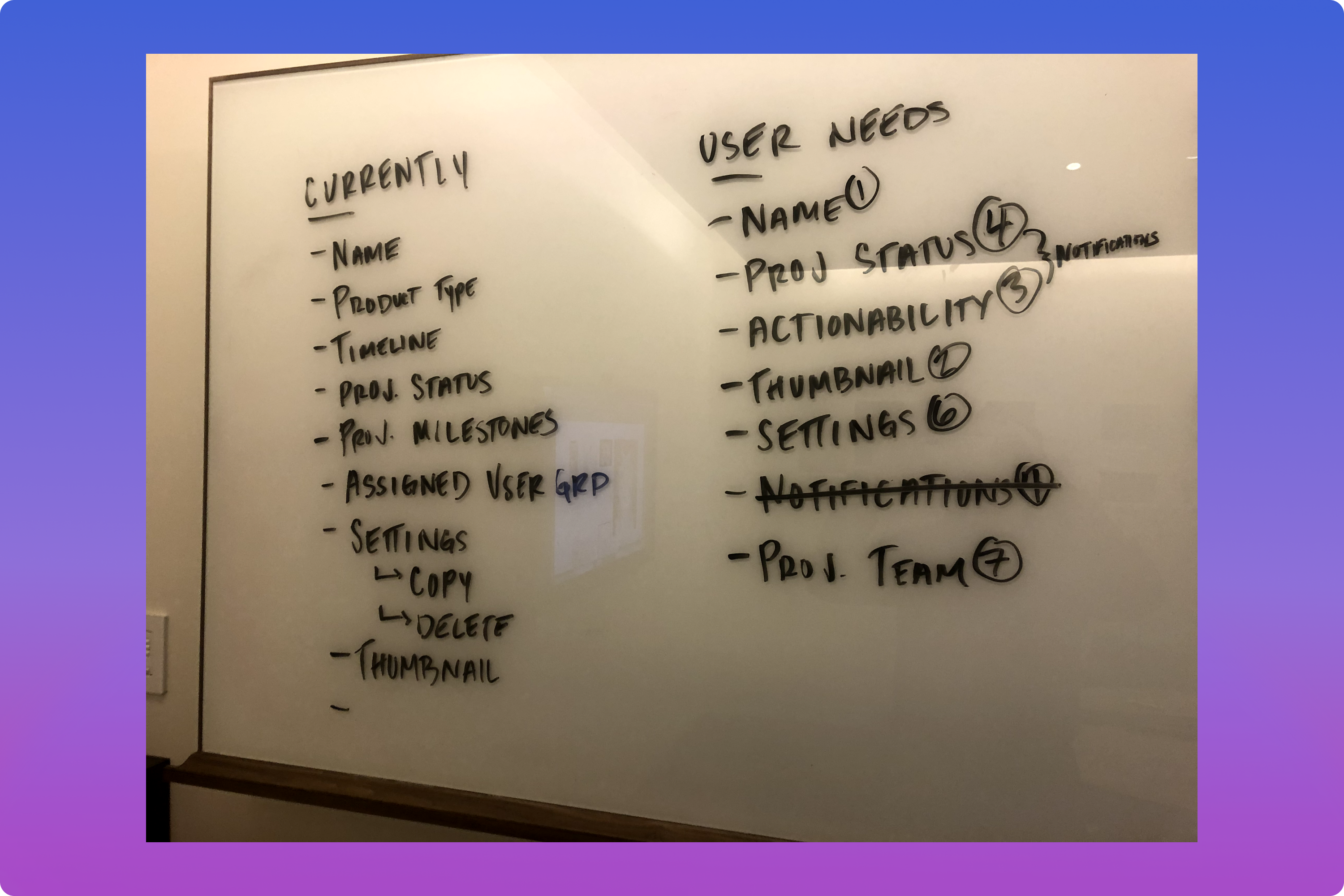
Ranking associated project information
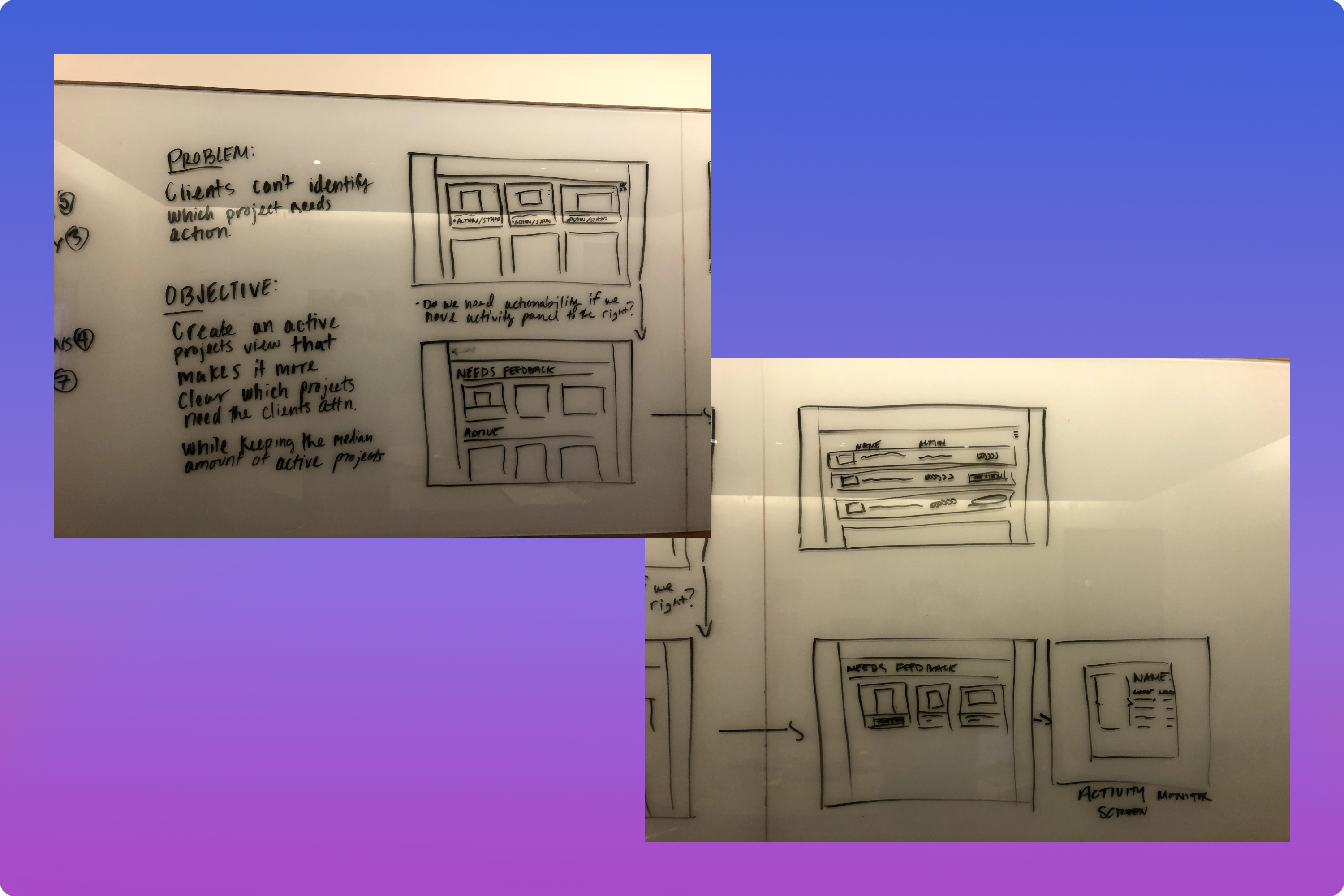
Initial whiteboard sketches
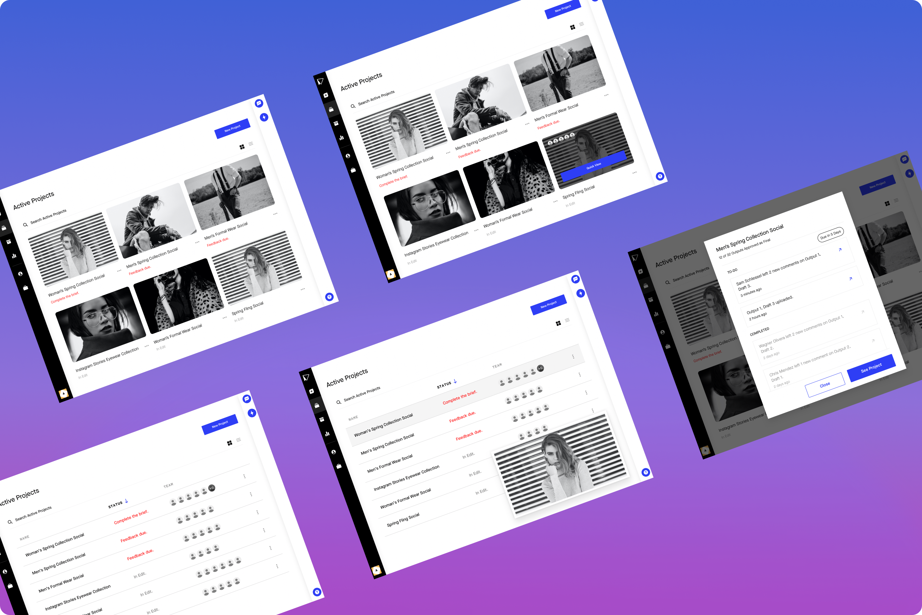
Wireframes for user testing
Solution:
A more visual layout to better highlight key project information utilizing a card based layout by default for accounts with less than 7 active projects and switching to a list view for accounts with more than 7 projects. We utilized a hover effect on the thumbnails to better display the aspect ratio of the hero output and further guide users in determining which project is which. The projects were also prioritized based on a series of criteria including status, project timeline, and deliverables.
For larger scale accounts the list view could be sorted to further refine the list of projects and allow users to narrow down their list of active projects while prioritizing their actions.
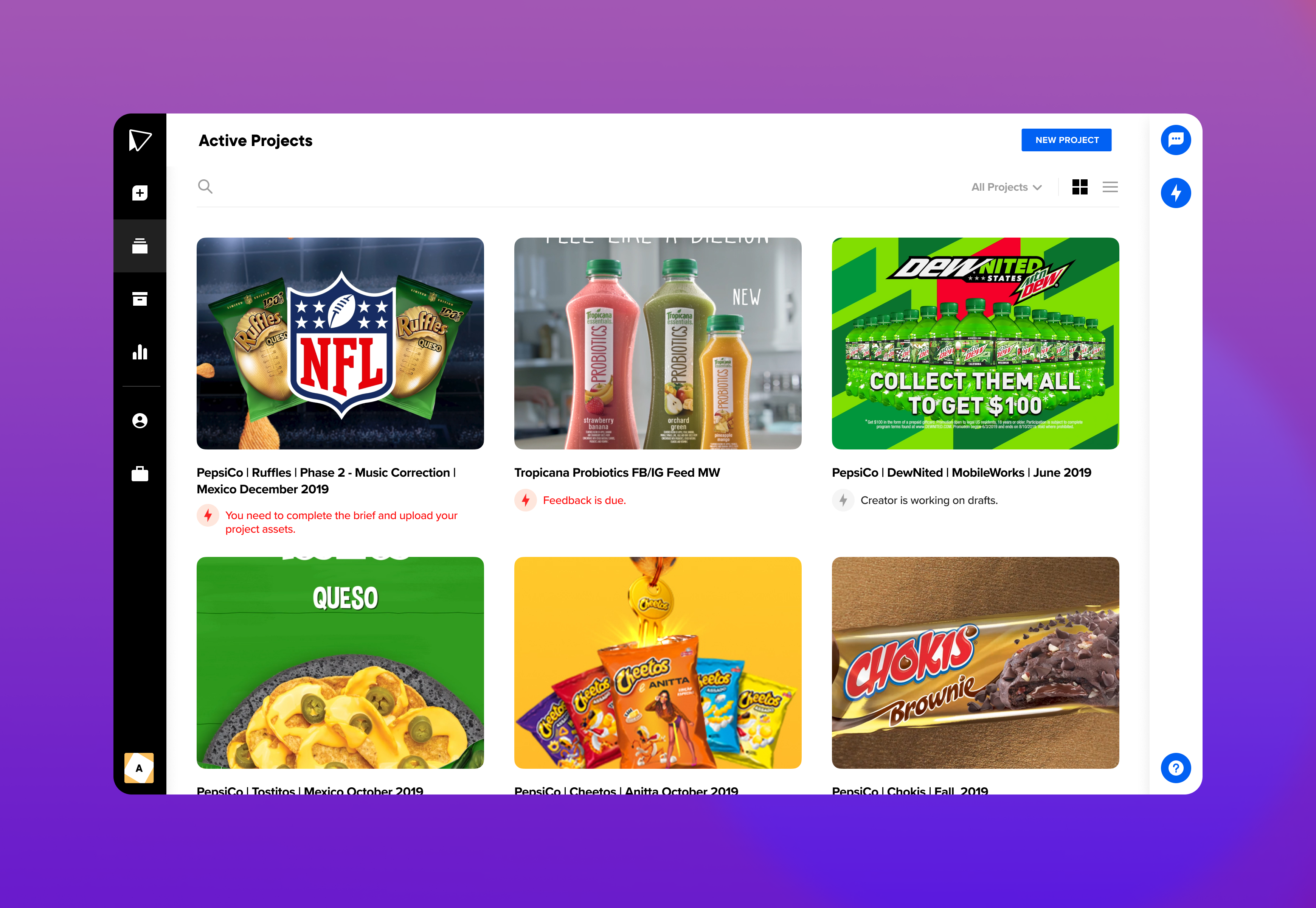
Card view
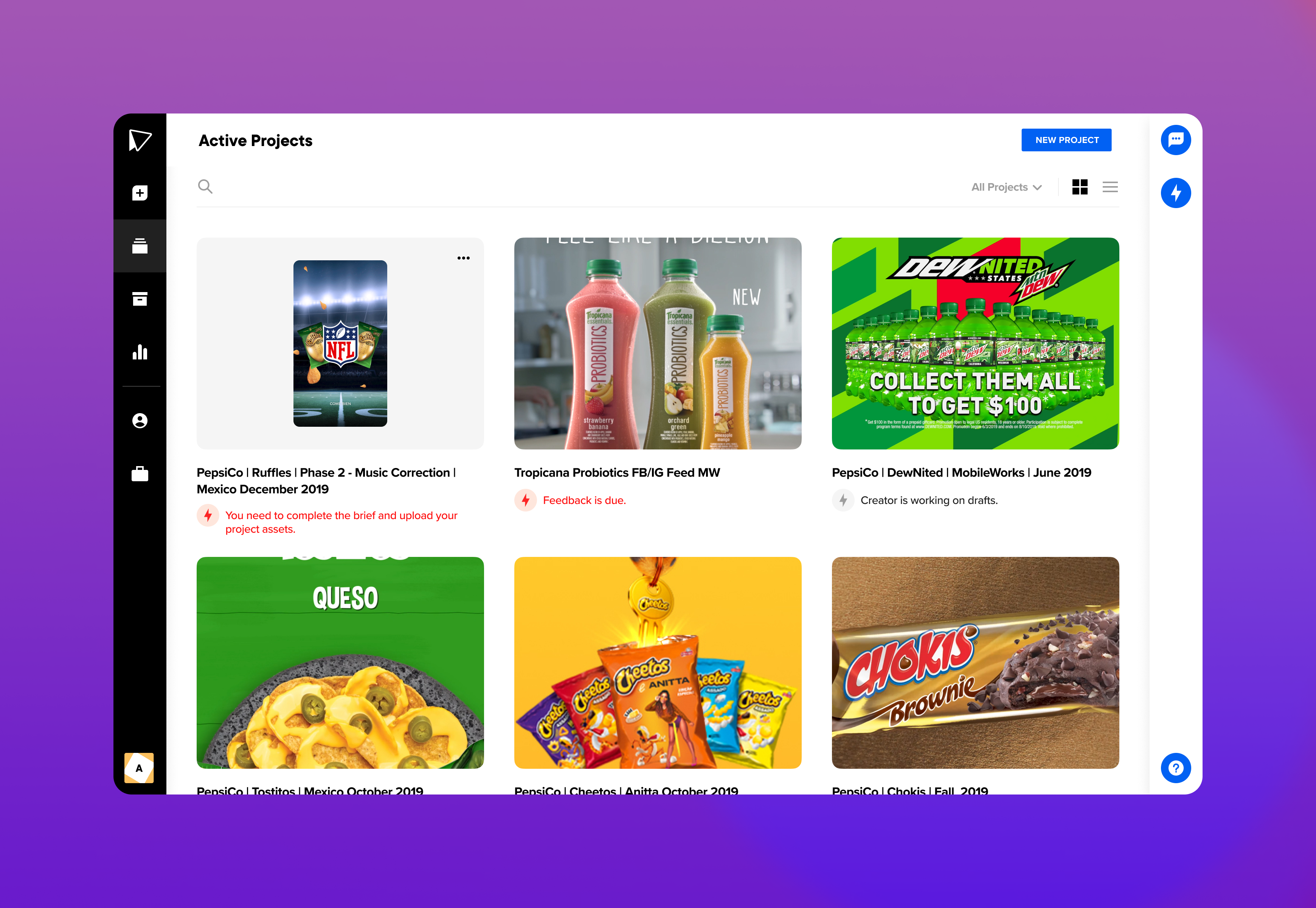
Card view hover state
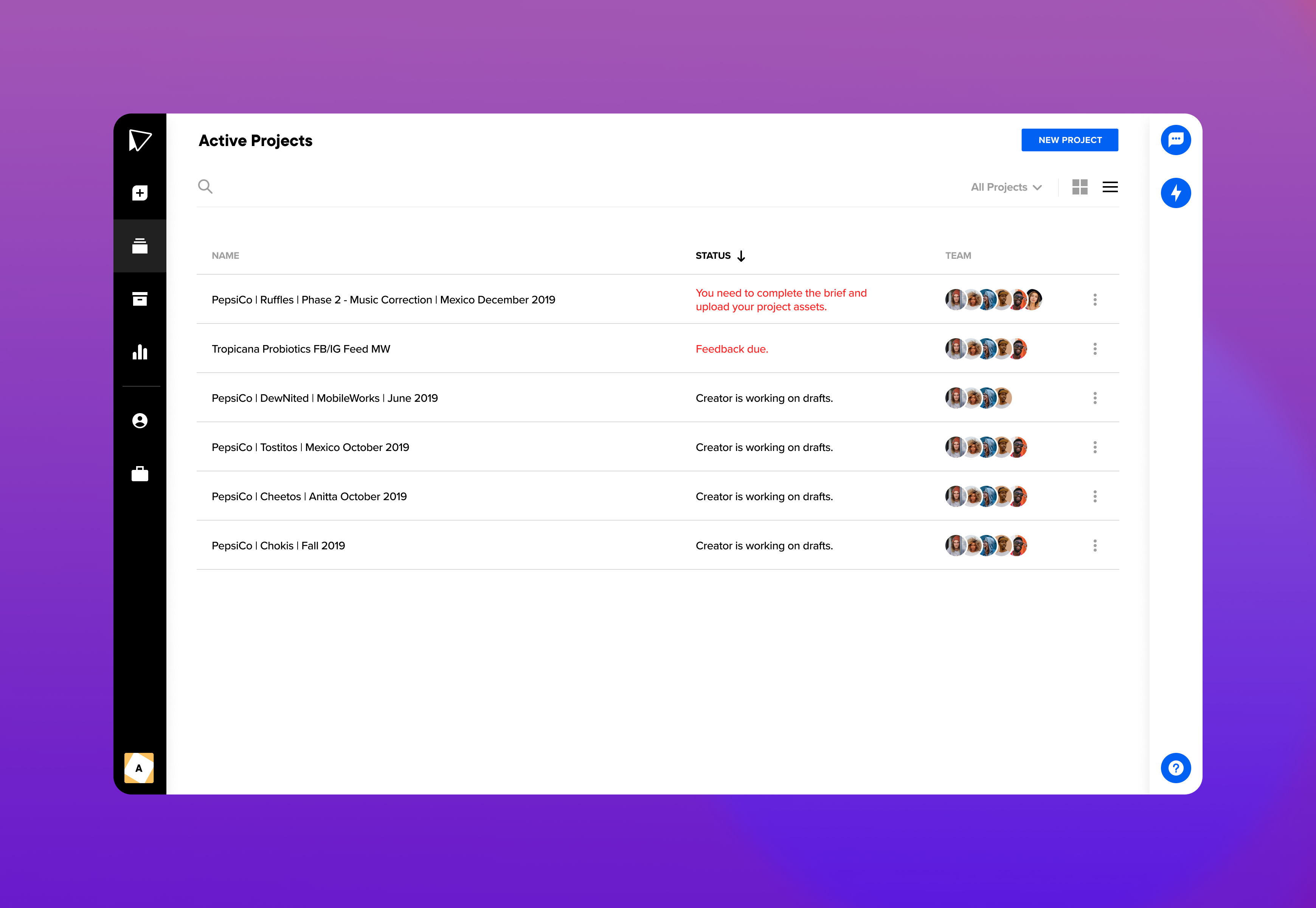
List view
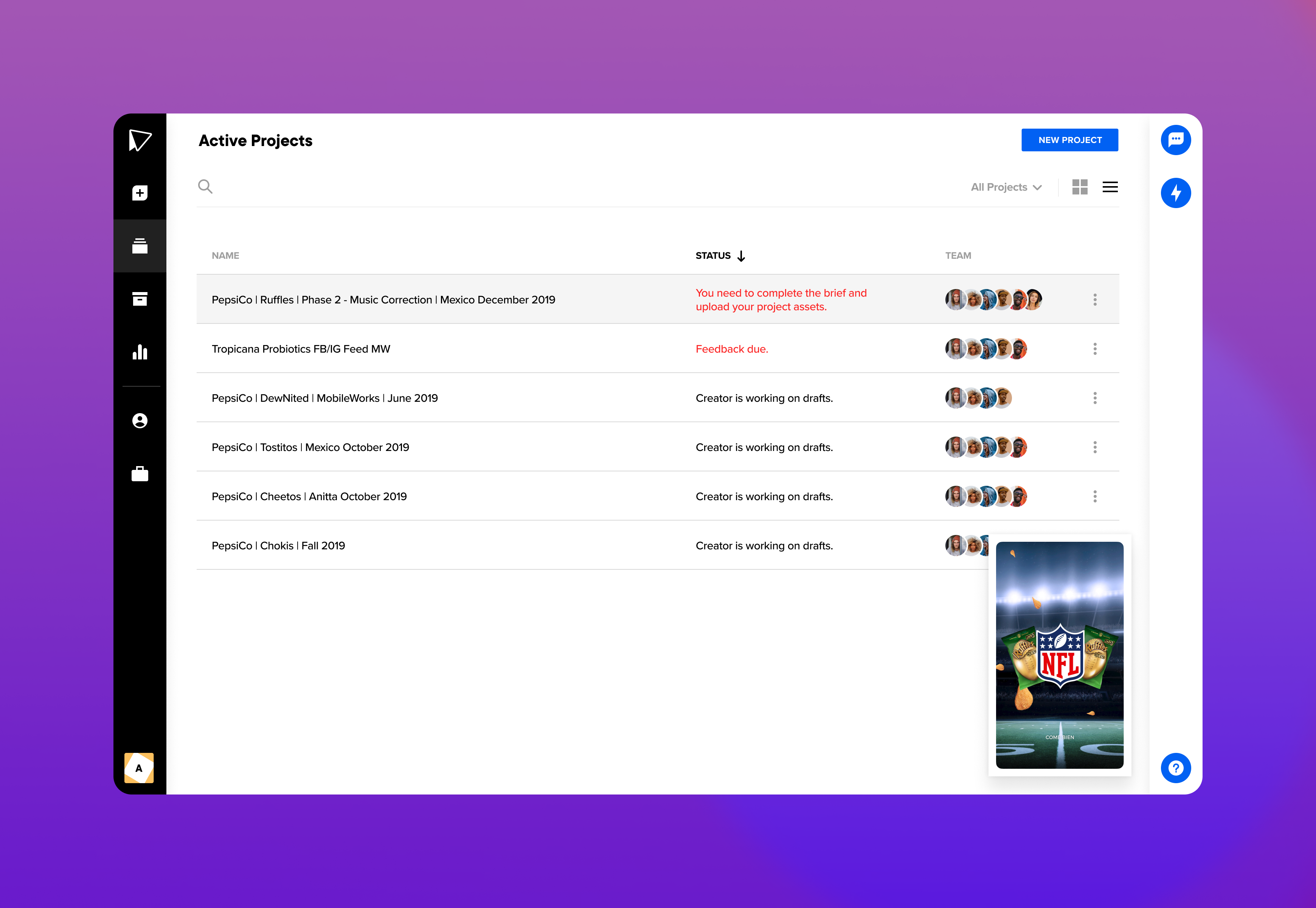
List view hover state
Prototype:
Results:
The work we did to redesign our active projects page led to a 22% decrease in time spent with a project being active. Reducing the time spent from 56 hours per project to 43.68 hours per project. We also reduced the number of communications sent out per project by 35%. All of this work combined to bring our number of active projects on average per account down from 8 concurrent projects to 5 projects.